More efficient tracking of job applications for recruiters

Redesigned applications overview

Detailed view of an application

Updated vacancy pag
About the project
Kenmerc offers a comprehensive HR solution, and my redesign focuses on the job applications & vacancy section of the total solution.
Goals
A complete redesign of the employee & applicant environment, including the development of a new mobile version for both target audiences.
Fase
In development
Role
Audit, workshop faciliator and design sprints.
Sector
B2B HRM solution
Tools
Figma
The challenge
After the acquisition of Kenmerc, I was asked to assist in redefining the app with a new visual identity. However, after a thorough analysis, I discovered numerous opportunities for improvement. Instead of just addressing the visual aspect, I proposed to overhaul the entire user experience. Fortunately, this plan was embraced, and we embarked on it.
The goal
The goal of the redesign was as follows:
- A simpler and more consistent experience throughout the app.
- A mobile version with the same functionality and recognizability.
- A well-deserved visual refresh.

Optimizing the application
After thorough preparation, I facilitated a UX workshop to validate assumptions and observe the software in action. This provided an opportunity to identify further needs and quickly transition to potential solutions.
One of the observations during my audit was that the app formed an incoherent whole. Finding information was challenging because the information displayed when opening an object could vary; this was often unnecessarily shown in a pop-up. The redesign created a clear distinction between overview and detail screens. Detail screens can display all relevant actions and contextual data, eliminating the need for numerous pop-ups.
One of the most drastic changes was the search system. Instead of a few simple search fields, a smart filtering system was introduced, similar to those found in e-commerce platforms. The power of this system is that it allows not only searching by term but also selecting combinations. Users can filter by specific attributes, input multiple locations, and specify salary ranges. None of this was possible in the old system but gives the user much more control over their data.
There was also a need to better handle certain specifics: an applicant could be referred, an internal employee, or even have multiple ongoing applications. This could also be a combination of specifics. However, there was no good way to communicate this, let alone to filter and search based on it. This was addressed by capturing everything not falling under a fixed category in variables, from which 'badges' are created and displayed colorfully at the top of the card. Administrators have the freedom to add their own badges, making all specifics individually clickable within the filter options.
There was also no real home screen. Group research revealed a need for a clear overview of key tasks. Specifically, this meant applications that were stagnant for a certain period, requiring action. The last update date has become a standard part of all application cards, forming the basis of a home screen indicating the number of stagnant applications per status. All upcoming appointments are also collected here for a clear overview of to-dos.
One of the major requirements was for the app to work on mobile devices. Keeping this in mind during the redesign, I built the design entirely on Flexbox, with the idea of making it as responsive as possible. By building as many elements of the application as 'columns,' it's possible to stack them vertically on a smaller screen like a mobile. Especially for mobile, it's much more convenient to work with detail pages instead of pop-ups, as there's simply no space for the latter.

Old dashboard

New main dashboard design
Simplifying reviews
Each application can be reviewed within the application using an emoji system. An emoji can indicate the sentiment towards a particular candidate, ranging from excellent to an expression indicating no match.
During the workshop, valuable insights emerged, such as the unclear functioning of review emojis.
- There was also a clear visual indicator that an application had no review; the neutral emoji was used for both a neutral review and a missing one. As a result, users had to open an application to distinguish between these two.
- The card displayed an 'average' of all reviews, but research shows that only the most recent review is considered relevant.
- The application on the dashboard differentiated between reviews filled by you as the logged-in user and those filled by another user through a difference in brightness, but this was perceived as confusing and unnecessary.
The reviews on the dashboard have been simplified: only the most recent review is displayed instead of an average, and there is no longer any distinction made regarding who filled out this review. However, a clear history is provided on the detail page so that the full history can be viewed.
Additionally, an 'empty' emoji has been introduced. This is the new default for every unfilled review. This eliminates the confusing dual meaning of the 'neutral' emoji and makes it immediately clear to the user that no review has been left.
The above points have also been taken into account for other review variants, such as thumbs up and the star system, ensuring a consistent experience within each review system.

Results
- A genuine dashboard page has been added where employees can instantly see important statuses per status, and all scheduled appointments are visible.
- With a more organized applicant card, relevant information is immediately visible. There is also a fixed place for all variables, such as internal employee, forwarded, or multiple ongoing applications.
- Reviewing has become much simpler. Only the most recent review is displayed, and if it's not filled out? It's empty. Of course, a history is visible on the detail page to prevent any confusion about a review.
- Filters have become more advanced, with statuses, multiple search terms, and toggling specific statuses now possible.
- Thanks to the Flex layout, the entire application is responsive, translating beautifully to mobile, where all functions work.
- And many other small but effective details that enhance the user experience.
Ready to create captivating digital journeys?
Let's dive into the possibilities over a virtual cup of coffee!
Also take a look at
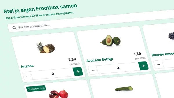
Giving users total control of fruit deliveries to the office.
A brand new environment where customers have full control over their fruit deliveries to the office.
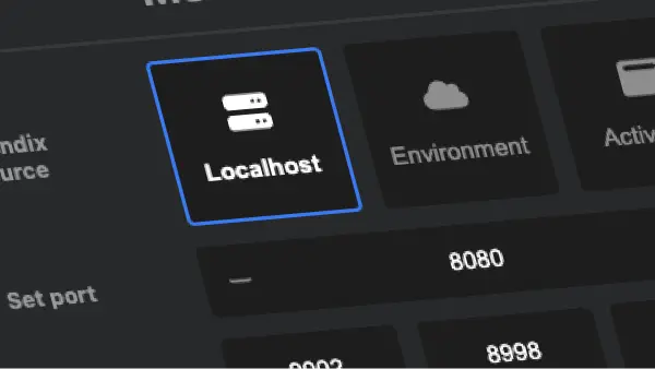
Testing Mendix applications faster & easier
A smart browser extension that helps to get into the right app, in the right environment, on your desired landing page.